Friday, 17 December 2010
My double page spread

This is my double page spread. My article is also on this page as well, I had a bit of an confusion with my article at first because of what i was planning to include in it as my front cover looked like it could appeal to the gay audience but yet I didn't want it to be a magazine that just attracts the gay market therefore after many discussions with my fellow students and teacher. I came to an conclusion to the magazine itself a special edition of a new DJ sensation who is gay and who wanted to share that to the whole world.
My contents page.

This is my contents page as it stands now. Some of the colors link to the front page e.g. the red used in the front page. The use of fronts used are the same as the front cover and throughout the magazine. The language is also the same as the language used on the front cover and the double page spread.

Evaluation on music magazine
For my music magazine I decide to create and produce a chart music magazine, as from what i found out from my research that there wasn't already this genre of music magazine on the market. Therefore I wanted mine to be unique but yet follow the codes and conventions of creating an successful magazine. I also wanted to bring a new market to the music magazine industry. Creating this magazine took a lot of time and effort in to it, even though there could still be room for improvements, I believe that I have created an successful magazine to the best of my ability.
1. In what ways does your media product use, develop or challenge forms and conventions of real media products?

 My music magazine uses codes and conventions in many ways such within the mastheads, pictures and general layouts that is shown in the real media. I have used code and conventions throughout my magazine, whereas on my front cover I have added my own style into it by making the main picture in black and white and also in colour, therefore it makes this unique effect to make the front cover more attractive and even though it was a risk that I took, I believe it works well and looks professional and that what I wanted my aim to be. I laid out my front cover in a traditional format; masthead, headlines around the the main picture and of course one main image. I also took another risk that did not follow the codes and conventions and that was to have a male model as my main image on my front cover, as from what I have researched that most music magazine either have a female model or a band etc. But in some aspects I wanted my music magazine to be different and therefore I had to take the risks and not follow the codes and conventions to achieve this. Even though it is very different to have a a male as the main image on the front cover, I did come across a magazine (Rollingstone) that was similar to the idea's that I wanted for my magazine. Therefore this magazine was my inspiration to creating my front cover and what my main image is going to look like but of course with different elements in it also.
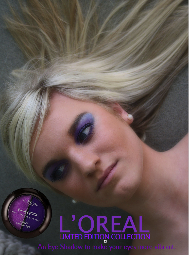
The colours used on the front cover work well with the main image, as the model is in black and white and the headphones that he is wearing is in colour and the colours that are the headphones are the colours that are used for headlines and title etc so the texts and image blend well with each other. The colours used on the front cover page are quite feminine, as they are bright and soft colours, therefore this will appeal to most gay's also. These colours also stand out well against the misty white background, therefore the texts and the image stand out more and the background doesn't take the focus away from the headlines etc.
As you can see in this image below that the title and the headlines are the same colour as the headphones, therefore it is a good contrast.

2. How does your media product represent particular social groups?
I created my magazine to an audience who have a passion and love for chart music and hottest tracks for that period of time etc. But also because I made this magazine a special edition, this special edition also appeals to the gay market as the model on the front cover is a new 'gay' DJ and he tells about his life being gay and his childhood in the article that I have also produce therefore this would appeal to the gay market but also still my original audience because it has features, review etc that will interest them as well.
 The image I have used is quite stereotyped because it is a 'fit' male model, like touching himself being cheeky and thats what you believe you see when you think of an gay person and I believe that the picture I have taken relates to a gay person as it has all those elements that you would expect to see for a gay person. I did this clearly to make sure that the gay audience and my original will easily recognize that its gay feature that is included in my magazine so therefore it will sell more as its a larger audience that will be attractive to my magazine. The clear ideology of my magazine is the conviction that the celebrity gossip advertised on my front cover will lure young adults into buying my magazine just with the images and the celebrity ideals such as gossip and drama. The image to your right, which are headlines in on the front cover of my magazine, show that there is gossip throughout the magazine with real celebrities.
I have chosen to represent my chosen social group in a good way by presenting the cover model to be looking happy, fun and attractive and by not actually saying that the he is gay as some people may be against that sexuality, so it promotes a good image. However this is subverted by the article in the magazine where the focus is on hanging around with the wrong crowd and different sexuality which is completely the opposite of what the audience believe this social group is against.
3. What kind of institution might distribute your media product and why?
I decide to not just do my music magazine to the gay market because doing it to the gay audience and the audience that have an interest in chart music will wider my audience meaning the magazine is more likely to be successful. As the gay magazine is not a wide audience and some people may disagree with the that sexuality it will reduce the amount of people that will purchase my music magazine.
4. Who would be the audience for your media product?
To find out who my target audience was, i carried out a questionnaire, asking a wide range of people a number of questions that relate to my magazine and that will help me to create and design my magazine. I asked a number of people that I knew who be interested in chart music. I got positive feedback saying that producing a music magazine will be a good music magazine and successful if it includes the right things and looks professional.
After producing my magazine I decided to go back to the people I asked in the questionnaire and see what they think of the my final piece When given back feedback from my target audience I wasn’t at all surprised as they all gave me similar answers to my expectations. such as that this magazine will be successful and appeal to the right audience that you are aiming it at from the pictures and language that I have used. However I did get some negative feedback about the layout of my magazine but with time and effort I was able to fix the mistakes that I made and so therefore I took in to consideration what the public thought of my magazine and make it even better.
I also did a 'wallwisher' where I could ask the public a question about my magazine and see what their responses are. So I asked them 'do you think my magazine will appeal to the gay audience?' but unfortunately only one person wrote on my wall, therefore was not able to get a better understanding of if it would appeal to the gay market because it was only one person's opinion. This is a link to my WallWisher ---> http://www.wallwisher.com/wall/blondie1993
5. How did you attract / address your audience?
My magazine attracts readers and gives a solo selling point. On my front cover I have used the codes and conventions to draw the attention of my audience. For example, I have made sure that the ‘hotspots’ at the top of my front cover are full with information so that that if my magazine was on a shelf it would be visible. My unique selling point of my magazine is the free posters they get with the magazine, I did this because I felt it would attract more of my audience to purchase the magazine, knowing that they will get something more in return when buying the magazine. I also attracted my audience by making the price not to high.
Hello magazine sell their magazines for: £2.50
1. In what ways does your media product use, develop or challenge forms and conventions of real media products?

 My music magazine uses codes and conventions in many ways such within the mastheads, pictures and general layouts that is shown in the real media. I have used code and conventions throughout my magazine, whereas on my front cover I have added my own style into it by making the main picture in black and white and also in colour, therefore it makes this unique effect to make the front cover more attractive and even though it was a risk that I took, I believe it works well and looks professional and that what I wanted my aim to be. I laid out my front cover in a traditional format; masthead, headlines around the the main picture and of course one main image. I also took another risk that did not follow the codes and conventions and that was to have a male model as my main image on my front cover, as from what I have researched that most music magazine either have a female model or a band etc. But in some aspects I wanted my music magazine to be different and therefore I had to take the risks and not follow the codes and conventions to achieve this. Even though it is very different to have a a male as the main image on the front cover, I did come across a magazine (Rollingstone) that was similar to the idea's that I wanted for my magazine. Therefore this magazine was my inspiration to creating my front cover and what my main image is going to look like but of course with different elements in it also.
 The colours used on the front cover work well with the main image, as the model is in black and white and the headphones that he is wearing is in colour and the colours that are the headphones are the colours that are used for headlines and title etc so the texts and image blend well with each other. The colours used on the front cover page are quite feminine, as they are bright and soft colours, therefore this will appeal to most gay's also. These colours also stand out well against the misty white background, therefore the texts and the image stand out more and the background doesn't take the focus away from the headlines etc.
As you can see in this image below that the title and the headlines are the same colour as the headphones, therefore it is a good contrast.

2. How does your media product represent particular social groups?
I created my magazine to an audience who have a passion and love for chart music and hottest tracks for that period of time etc. But also because I made this magazine a special edition, this special edition also appeals to the gay market as the model on the front cover is a new 'gay' DJ and he tells about his life being gay and his childhood in the article that I have also produce therefore this would appeal to the gay market but also still my original audience because it has features, review etc that will interest them as well.

I have chosen to represent my chosen social group in a good way by presenting the cover model to be looking happy, fun and attractive and by not actually saying that the he is gay as some people may be against that sexuality, so it promotes a good image. However this is subverted by the article in the magazine where the focus is on hanging around with the wrong crowd and different sexuality which is completely the opposite of what the audience believe this social group is against.
3. What kind of institution might distribute your media product and why?
I decide to not just do my music magazine to the gay market because doing it to the gay audience and the audience that have an interest in chart music will wider my audience meaning the magazine is more likely to be successful. As the gay magazine is not a wide audience and some people may disagree with the that sexuality it will reduce the amount of people that will purchase my music magazine.
4. Who would be the audience for your media product?
To find out who my target audience was, i carried out a questionnaire, asking a wide range of people a number of questions that relate to my magazine and that will help me to create and design my magazine. I asked a number of people that I knew who be interested in chart music. I got positive feedback saying that producing a music magazine will be a good music magazine and successful if it includes the right things and looks professional.
After producing my magazine I decided to go back to the people I asked in the questionnaire and see what they think of the my final piece When given back feedback from my target audience I wasn’t at all surprised as they all gave me similar answers to my expectations. such as that this magazine will be successful and appeal to the right audience that you are aiming it at from the pictures and language that I have used. However I did get some negative feedback about the layout of my magazine but with time and effort I was able to fix the mistakes that I made and so therefore I took in to consideration what the public thought of my magazine and make it even better.
I also did a 'wallwisher' where I could ask the public a question about my magazine and see what their responses are. So I asked them 'do you think my magazine will appeal to the gay audience?' but unfortunately only one person wrote on my wall, therefore was not able to get a better understanding of if it would appeal to the gay market because it was only one person's opinion. This is a link to my WallWisher ---> http://www.wallwisher.com/wall/blondie1993
5. How did you attract / address your audience?
My magazine attracts readers and gives a solo selling point. On my front cover I have used the codes and conventions to draw the attention of my audience. For example, I have made sure that the ‘hotspots’ at the top of my front cover are full with information so that that if my magazine was on a shelf it would be visible. My unique selling point of my magazine is the free posters they get with the magazine, I did this because I felt it would attract more of my audience to purchase the magazine, knowing that they will get something more in return when buying the magazine. I also attracted my audience by making the price not to high.
Hello magazine sell their magazines for: £2.50
OK! magazine sell their magazines for: £2.70
Whereas Im selling my magazine for £1.95 but thats not to say it bad quality or does not have the features that they may have because from my opinion it can be just as good as those magazines.
6. What have you learnt about technologies from the process of constructing this product?
6. What have you learnt about technologies from the process of constructing this product?
I have also made sure that I havent made the layout and design of the magazine to formal and boring but yet havent made it too childish.
While creating this media product, i have learnt how to use a different range of sofwares to design and create your final piece. I have learnt to experment with new tools on the computers softwares such as editing photo's, layouts and texts and adding effects aswell. I have always been computer litural and very creative with my design work but I feel that experiencing different softwares has increased my level of knowlegde about design work and techolongy you may use.
I have learnt how to use an Apple mac as I had never used one in my life before, however after many weeks of experimenting and using one I was able to overcome this fear using an apple mac.
Even I take photography as an A level as well, producing a professional music magazine photo did have it difficulties, such as getting the angle, lighting and positioning correct and to fit in with my magazine. But with lots of practice, I feel that I have produced some good quality and professional looking images.
Photoshop was one of the softwares I used to make my images even better. I enjoyed working and experimenting with this software and had great fun testing out new tools on photoshop. To begin with I used a YOUTUBE clip to help me understand and know what photoshop offers and I found this very helpful and useful for someone like me who was a beginner at photoshop and I even feel that now I can create a YOUTUBE clip about photoshop by myself. This was the link I used http://www.youtube.com/watch?v=VBv3mIsKKRs
I would say that I have not been limited by the technology used because the Mac’s have so many applications and extras on them that I could easily do all that I wanted. However if i knew more knowledge about the softwares that are on a mac I reckon I could massively improved my magazine.
7. Looking back at your preliminary task, what do you feel you have learnt in the progression from it to the full product?
Looking back at what I produced on my preliminary task, I feel that I have improved my knowledge of creating a magazine massively. As you can see from my school magazine, I was very weary of how magazines create there layout and what needs to be included even after research I still struggled.

The pictures I also took are not as good quality and professional looking as my ones for my music magazine, and you can tell this by the way it has not been edited, the angle, lighting etc.
I feel that I could of managed time more apportiatly because I feel that I left most of it to the last minute, meaning I wasn't able to take time on my research, magazine and evaluation to make it outstanding, so time management was one of the biggest problems I came across. But with determination and effort I was able to complete all the tasks to the best of my ability.
Overall I have enjoyed creating this music magazine and I feel have achieved a lot in last few months with producing both my preliminary task and music magazine. I have learnt how to use a different variety of softwares to improve my magazine and make it outstanding. But i feel as if I was to do this task again it will be much improved because I would manage the time better and work better with the softwares I use.
Rate Cards

Above is a Rate card for NME, this includes things such as how much it costs to advertise in their magazine and what type of people who read the magazine. For this magazine their target audience is more for males in their 20's with an average income, even though there are other people that read the magazine that is the main target audience, as with the types of advertising in this magazine are more aimed at males in there 20's. Also NME is aimed at big groups of people rather then specific types of people where as magazines such as classic rock have got more of a smaller market.
Photoshoot 2


 I believe that the angles and the positions of these pictures are very well thought through and when editing them I made them look professional, like pictures you would see in a beauty magazine or any other successful magazine. I feel that this picture to your right, is one of my favourite pictures, i like the lighting of the photo, the position of the model and the angle that it has been taken from. I also feel that the background is very effective because it doesn't take the focus away from the model herself. Therefore this was the picture i used for my make up advert within my magazine.


Flat Planning
Flat planning is a way to show what will be included in my magazine on each page as on this task I am not completing and creating the whole magazine, therefore I had to show that I also was thinking about the whole magazine not just the front cover, contents page and one double page spread, so its clear that I also know the knowledge of creating the whole magazine.


My Audience Research
To find out what my target audience want from a chart music magazine, I carried out a questionnaire for the puplic to complete. I chose 5 people who I thought would be my target audience and they all gave me back useful information which will help me to produce a succesfull, outstanding music magazine.
Firstly I asked them simply if they would like to see a chart music magazine on the market, most of them gave back positive feedback saying "Yes it would be great to have a chart music magazine on the market as there is not one already". But one person stated that they would not purchase a chart music magazine, as there is other ways to find out the hottest tracks such the television, radio and internet therefore she didnt feel it was necesscary that she would have to buy a chart music magazine to find what the new releseases. I did take this feedback into consideration as it was true but in some aspects thats was her opinion, whereas she might rather find out the lastest tracks on the tele, other people might rather buy a magazine about the lastest tracks and read more into the new songs. Also it shows that the majority of people wanted a chart music magazine and that it was just one persons opionion therefore I still believe that a chart magazine will be successful.
I then questioned them saying what other music magazines do you already puchase or have purchased before. I asked this question to find out what my target audience already purchase for their music magazine, so I could also find out who my competitors were and what I can do to compete with them. Two of the people I asked said they purchase NME as their music magazine which is a very successful, well known music magazine and will be my biggest competitor. One person said they puchase Kerrang which is not really a big competior as there genre of music is very different to chart music. But there was two people that said that they dont purchase any music magazine but thats not to say they wont purchase mine if its up to perfessional standard.
Next I asked them what price are they willing to pay to purchase the magazine. This was to make sure I didnt over price my magazine putting it out of people budget range or under price it so that I wasnt making any profit and the price making it look like the magazine it bad quatlity, cheap and useless. Most of the majority of people would be willing to pay from £1.50 to £3.50 for the music, depending on the quality of it.
Pricing is a very important part of creating a publiching a magazine, and its an aspect I would have to think very carefully about before deciding.
I then asked them would they like a free gift to be included with the magazine and all of there repsonses was that they would like that. Therefore this has shown me that creating a magazine with a free gift inside will make my target audience more likely to purchase the magazine.
I asked them how often they would want the magazine to be relseased, weekly, forenightly or monthly. There reponses was one person wanted weekly, 3 people wanted forenightly and then one person wanted monthly. The reason why the majority of the people wanted it to be forenighly is because thats a reasonable amount of time for the chart hits to be changed etc. Therefore I am highly considering publishing it every forenight.
Lastly I asked them would they like there to be interviews with succsessul artists and information about them, and I got back postive responses as most of them wanted there to be a section in the magazine with interviews so therefore I think I will include this in my magazine as there was a high percentage of the people I asked wanting it.


NME Contents analysis.

NME's target audiences are mostly male at the age around 23. The readers are known to be people who enjoy live and active music, particularly single tracks and is also a music completist. NME's target audience are also known to mostly be people in full time work and students, such as teenagers and young adults due to the research that NME have carried out and you can tell by the way that their magazines are layout and the language used, so this also attracts the right target audience. The NME's audience also have a high interest and enthusiasm for live gigs where this is highlighted in most of the magazines that MNE produce such as festivals like Reading and Glastonbury and other sponsored tours around the country.
Style/Layout/Mode Of Address.
The codes and conventions that you mostly are expected on the front cover of NME magazine is that it is presented in tabloid A3 format, printed in colour ink not like a newspaper. Also the single image with minimal text is what you are expected to see on the front cover of the magazine, as this is the norm of how a magazine should be laid out or sometimes with a band on the front cover instead of just one artist. There is also a section on the front cover where it promotes a free classic poster to the readers which attracts the audience to purchase the magazine as they are believed to be getting something free out of buying the magazine. Featured artists, articles and information on gigs etc are the found the whole way through the magazine, where it is also laid out in sections suited for the artist etc and presented professional and neat. So therefore it is easy to read and look at, other than if loads of information and pictures where crammed onto one page, unlike children magazines. There is also adverts throughout the magazine, that will all attract the NME;'s target audience for example, HMV adverts, Alcohol adverts and Gigs that are coming up adverts etc. The age profile is also located in the publications mode of address and language used, illustrated on the cover and throughout the magazine. Use of slang and sometimes expletive are evident throughout the pages and genre-specific terminology.
The NME is associated with less mainstream pop music and is a valuable promotional tool for independent labels and artists. It is an attractive publication for the music enthusiast who listens to contemporary music, attends gigs and festivals and wishes to keep up to date with successful bands and new and unsigned acts.
The whole magazine itself sends of a vibe of passion and love for music throughout the magazine by illstrating how beautiful and unquie every song can be in every genre. The creaters of MNE have also designed the magazine to be attractive as they have realised this is the key concept of a successful magazine, while also thinking about how interesting and informative the magazine itself has to be, and as a reader and my opioion I believe its a good successful and well presented magazine.


Audit of Observer Music Monthly
 Observer Music Monthly.
Pg. 1 Advert.
Pg 2. Contents page.
Pg 3. Hmv Advert.
Pg 4. Sounding Off regulars
Pg 5. Soundtrack of my life regulars
Pg 6. Feedback regulars
Pg 7. Play.com advert
Pg 8. Headliners regulars (Double page spread)
Pg 9. Headliners regulars (Double page spread)
Pg 10. Headliners regulars
Pg 11. Virgin advert
Pg 12. Advertisement promotion.
Pg 13. Headliners regulars
Pg 14. Summer gigs advert.
Pg 15. Headliners regulars
Pg 16. Mika feature (Double page spread)
Pg 17. Mika feature (Double page spread)
Pg 18. Jack Daniel's advert.
Pg 19. Mika feature
Pg 20. Mika feature (Double page spread)
Pg 21. Tickets advert.
Pg 22. Mika feature
Pg 23. Session musicians (Double page spread)
Pg 24. Session musicians (Double page spread)
 Pg 25. Tickets advert.
Pg 26. Flash forward feature
Pg 27. George Harrison (Double page spread)
Pg 28. George Harrison feature
Pg 29. Adverts.
Pg 30. Faroe islands feature (Double page spread)
Pg 31. Faroe islands feature (Double page spread)
Pg 32. Advert.
Pg 33. Review
Pg 34. Reviews (Double Page Spread)
Pg 35. Reviews (Double Page Spread)
Pg 36. Reviews (Double Page Spread)
Pg 37. Adverts.
Pg 38. Film/ books/ online.
Pg 39. Record Doctor regulars (Double page spread)
Pg 40. Adverts

Pg 42. Flashback regulars.
Last page. Adverts
Back cover. Hmv advert.
Wednesday, 24 November 2010
Photoshoot


These are my orginal photo's which havent been edited or cropped etc. I wanted the background of image to be plain, therefore I got my model to stand up against an white wall, so the focus is all on the model not taken away by the background. I got the inspiration of the poistion of the model from an actor "Zac Effron". I made him wear headphones as this represents the music part for the music magazine. 

Subscribe to:
Comments (Atom)